

Length
Role
Deliverables
8 Weeks
UX/UI Designer
Low fidelity wireframes, interactive prototype, high fidelity designs.
Tools
Sketch, Abstract,
Flinto, Keynote
Problem
Topcon is a multi-national corporation that provides positioning technology for surveyors, civil engineers, construction contractors, equipment owners and operators. A huge interactive screen that spans a full wall exists at the Topcon North American HQ. With this screen visitors are able to explore Topcon products by exploring an interactive job site. Topcon wanted to recreate this experience on a smaller scale for use by their sales team in meetings across a wide variety of locations from busy job sites to quiet conference rooms. The experience needed to be fully interactive, robust and presenter friendly while minimizing unnecessary busyness such as excessive animation and screen transitions. The end product needed to be designed for use on tablet devices as well as large touch-screen displays.
Topcon is a multi-national corporation that provides positioning technology for surveyors, civil engineers, construction contractors, equipment owners and operators. A huge interactive screen that spans a full wall exists at the Topcon North American HQ. With this screen visitors are able to explore Topcon products by exploring an interactive job site. Topcon wanted to recreate this experience on a smaller scale for use by their sales team in meetings across a wide variety of locations from busy job sites to quiet conference rooms. The experience needed to be fully interactive, robust and presenter friendly while minimizing unnecessary busyness such as excessive animation and screen transitions. The end product needed to be designed for use on tablet devices as well as large touch-screen displays.
Pain
Points
-
Navigation is unintuitive. It’s difficult for user to orient themselves.
-
Page views/screens lack hierarchy. Relationships between content are unclear.
-
Animations are distracting and add additional time for user to get content.
-
On larger screens, it is physically tedious to reach the different touch points.
-
Lack of visual hierarchy and contrast makes content difficult to consume.
Key Goals
-
Eliminate unnecessary steps that serve as a barrier.
-
Allow user to efficiently navigate through experience, regardless of screen.
-
Utilize familiar and consistent design patterns to inform user, establish clear relationships and set expectations.
-
Provide flexibility to add additional assets in the future, if needed.
-
Simplify. Present user with relevant information and reduce visual noise.
-
Elevate experience with consistent and purposeful user interface.

What We Heard
"I want a simplified navigation. I want this to make sense and be easy to use in any environment."
- Key Stakeholder
Concept
My team set out to design a tool that was easy to use, not dependent on any specific physical environment and attuned to the needs of a presenter. We wanted to improve the overall experience while simultaneously minimizing pain points of the primary users and meeting the desires of the business stakeholders. Working hand-in-hand with our internal development team helped us to understand and push the boundaries of what was possible for our team to build within the given timeline in a way that maximized innovation and accomplished all of the client's key goals.
We designed two different approaches to the experience in wireframe format, annotated the experience to call out important features, functionality and uses and created clickable prototypes to present to the client.
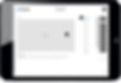
Approach 1
A
Accessible menu across entire experience allows users to easily navigate between epics, regardless which screen they’re currently on.
B
Scalable home screen accommodates unlimited number of epics. Users can easily swipe up or down to access more or from main menu.

A
B

A
B
C
D
A
Full screen takeover allows the user to focus on main content
B
Persistent title bar with epic, story and product name ensures user knows where they are at all times
C
Right rail navigation bar under main menu keeps navigational elements consistently accessible. Active call-to-action states and titles indicates what story users are on.
D
"Close" call-to-action allows users to quickly get back to epic with a single tap
A
Product submenu only appears when needed and stays in right rail for easy access.
B
Content adjusts in order to shift the users focus to active navigational elements.
A
B
Approach 2

A
B
A
Sections are simply organized by theme. The landing page is scalable and can hold unlimited number of epics.
B
Persistent main menu across entire experience allows users to efficiently navigate between epics, stories, or change language.
A
Header labels above content reinforce current category and subcategory.
B
Left navigation collapses, giving more real estate for main content. Selected state orients user within story and informs them what assets are available.
C
Thumbnail image teasers and swipe navigation allow user to view other assets consecutively or jump ahead or back quickly while adhering to a standard expected behavior for image galleries within apps.

A
B
C

A
A
Main menu at bottom of screen is handy and easy to reach, allowing users to efficiently navigate to epics, stories, or switch language.
Primary content grays out to allow user to focus on current task and avoid misclicks.


Solution
After several rounds of presentation, feedback and revision the client chose a direction and a fully fleshed-out visual design was made and turned in to an interactive clickable prototype. The prototype was used for testing on devices and internal circulation amongst the client team. The designs were then handed off to our developers who began to build it with the help of my team providing visual QA and product design oversight.
